Works

Aberdeen Advisor - Driving Self-Service & Efficiency at Aberdeen

Image
Service
User Research, Prototyping, Workshop Facilitation, Service Design, User Interface
Tools
Figma and UserTesting
Year
2025
Visit Website
Visit Website
Arrow

Role: Senior Product Designer | Project Length: 9 Months

The Challenge: Restoring Trust and Efficiency

Aberdeen, a highly-utilised investment platform, faced growing challenges following a major rebrand, mixed customer service experiences, and product stagnation. This resulted in high call volumes and declining adviser confidence in their ability to manage client cases efficiently.

I joined the newly formed Digital Servicing team with a clear, ambitious objective: Reduce customer experience calls by 15% for the Wrap platform by enhancing self-service capabilities for financial advisers and admin teams. This required a deep dive into the core reasons for contact and delivering precise, high-impact solutions.

My Impact: Implementing a Strategic, User-Focused Process

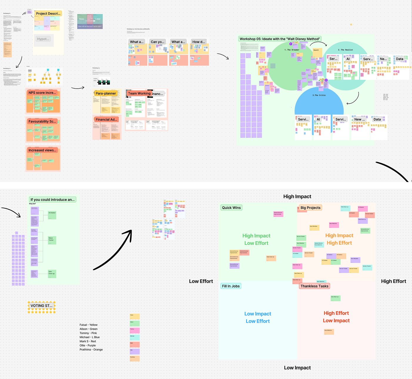
As the only team member with specific expertise in early product discovery, I took ownership of implementing a structured, Lean UX methodology from day one.

My work was instrumental in shifting the team's focus from feature delivery to outcome-driven design:

  1. Establishing Alignment: I led a series of workshops focused on creating a unified Problem Statement, performing Impact Mapping, defining Personas, and generating clear User Outcomes.
  2. Data-Driven Discovery: To ground our work in reality, we systematically listened to adviser calls and analysed call centre data tags, which revealed three core pain points: lack of case status updates, confusion on performing platform tasks, and difficulty finding essential forms.
  3. Prioritisation & Ideation: I facilitated an ideation session using the Disney Walt Method, followed by an Eisenhower Matrix prioritisation workshop (Impact vs. Effort). This led the team to strategically focus on two high-impact, low-effort avenues: building a case status tracker and redesigning the help centre navigation.
Workshop Screenshot
"Faisal has been a standout contributor on the abrdn project... His facilitation around problem statements and tree mapping was particularly impactful. Stakeholders now see design as a strategic asset, not just a delivery function. Through initiative and clear thinking, Faisal has built trust and helped elevate the role of design across the organisation." — Angus Allan, Senior Product Manager

Solution 1: The Case Status Tracker Dashboard

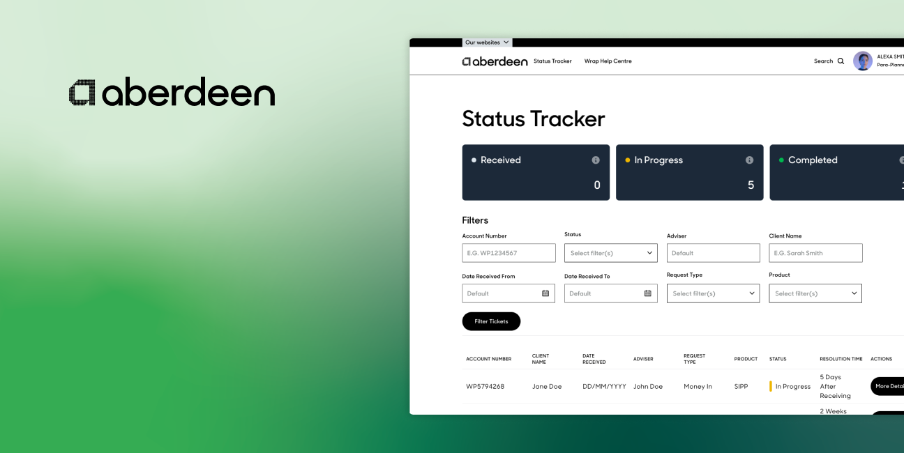
The primary driver for support calls was the complete lack of visibility once a case (e.g., adding funds) was submitted via email. Advisers had to call to chase updates, draining admin time and causing frustration.

Design Iteration & Resolution:

  • Problem: Initial research showed that users called because they lacked contextual data—they knew the status but not why a delay occurred.
  • Action & Result (High Impact): I led the design of an interactive Status Tracker dashboard. The key design breakthrough was the introduction of a detailed pop-over modal. This modal not only confirmed the client and adviser details but also displayed the Case Timeline and a Case Log that pulled internal agent notes.
    • Challenge Overcome: Implementing this feature required significant cross-functional work, including persuading the back office to expose necessary data and collaborating with agents to ensure their notes were written in end-user friendly language.
  • Refining Terminology: Through testing prototypes (created using Figma Make), I identified that the term "Pending" was confusing. We swiftly updated the status to the more intuitive "Received," clarifying the first step of the process.

This feature immediately empowered users to self-serve for status updates, directly addressing the highest volume of chase calls.

Status Tracker Designs and Research Report

Solution 2: Overhauling the Help Centre Navigation

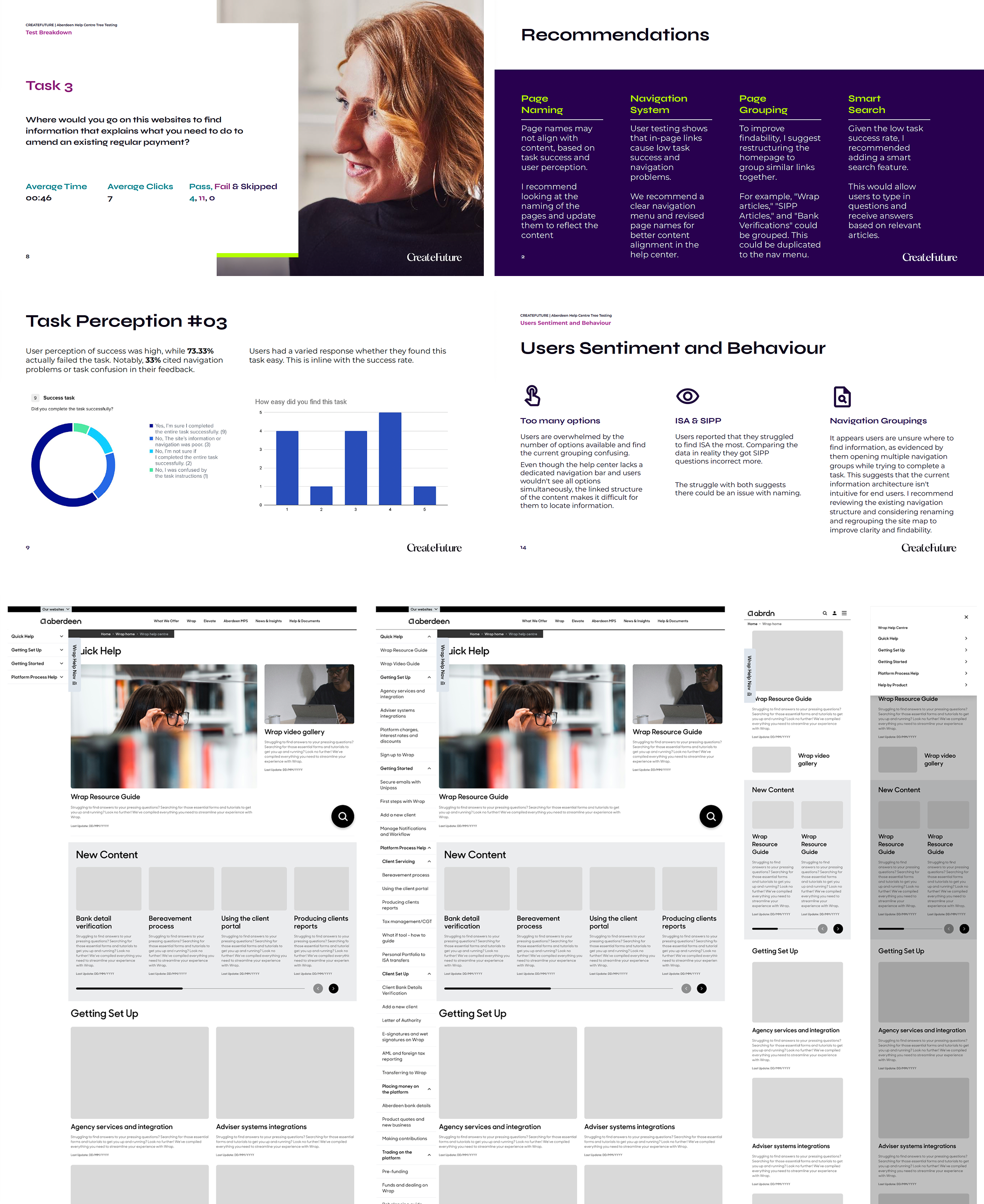
Our second focus area was improving the self-service knowledge base. Tree testing revealed that the current help centre navigation had a 0% success rate across five common tasks and took users up to 18 minutes to find information. This was caused by internal business terminology and excessive options (choice overload).

Design Iteration & Resolution:

  • Discovery: I ran workshops with account trainers and end-users to understand their terminology. We confirmed that the pages were named after internal business processes, not external user needs.
  • Action & Result:
    1. Renaming: I drove the renaming of all key pages based on user-centric language identified in the workshops.
    2. Reducing Overload: I reduced the primary navigation structure to only display the top 27 most-clicked items, creating a clear path for the vast majority of user journeys.
    3. Consistency: I designed a dedicated, consistent navigation panel to replace the scattered links, providing users with a reliable way to navigate the resource guide.

This overhaul transformed the help centre from an unusable internal directory into an effective, navigable self-service tool, drastically cutting the time users spent searching for common answers.

Help Centre Designs and Research

Conclusion: Exceeding OKRs and Redefining Design Value

By strategically applying Lean UX principles, leveraging user research, and focusing development on two high-impact features (Status Tracker and Help Centre Navigation), the Digital Servicing team not only met but significantly exceeded our primary objective.

Key Result Area Target Actual Result Impact
Customer Support Call Reduction 15% 25% Reduction Directly reduced operational costs and increased adviser efficiency.
Delivery Time N/A 30% Reduction Lean UX implementation improved team velocity and cross-functional alignment.
Team OKR Performance N/A 25% Uplift Validated the strategic value of the delivered features.

This project successfully established design as a strategic partner at Aberdeen, proving that targeted UX improvements, driven by rigorous discovery and iterative testing, can deliver substantial, measurable business outcomes and profoundly improve the customer experience. The 25% reduction in call volume is a direct measure of the success of the self-service journeys I conceptualised and delivered.